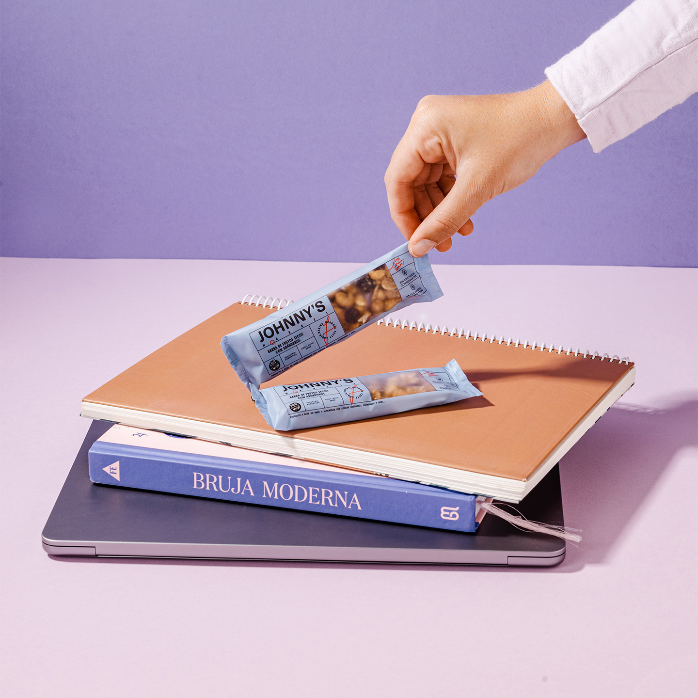
Healthy indulgence for everyday life 01.05.2023 — Buenos Aires, Argentina

Johnny’s Market, 01.05.2023
Buenos Aires, Argentina
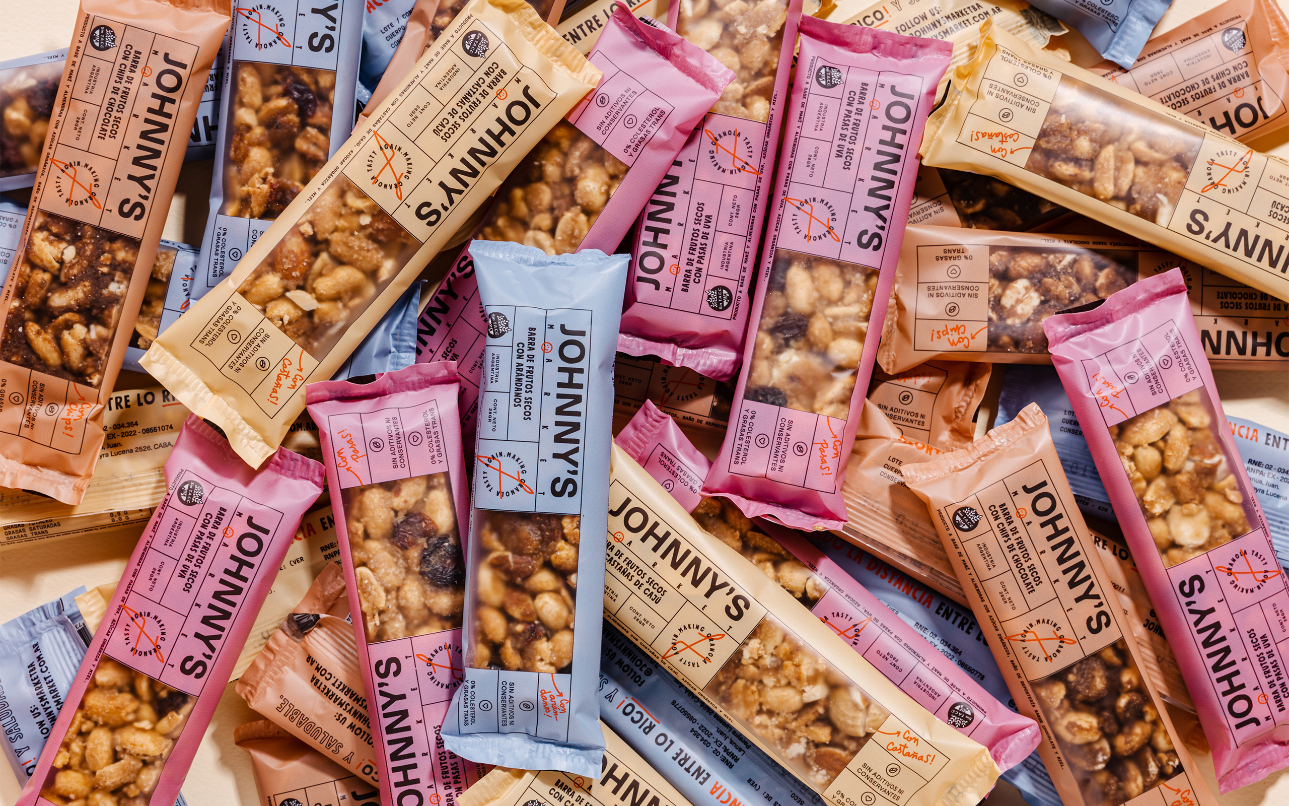
Johnny’s Market is a family-owned business that expanded their product line to include cereal bars and realized that the packaging did not reflect the brand’s personality, and they wanted to take it up a notch.


PROBLEM & INSIGHT
The company had never defined neither a brand strategy nor a brand personality and this reflected cleary on it’s visual identity which was a little basic and dull. With so much competition in the organic, healthy, and tasty food market, we knew that the brand had to stand out.
On the other hand we understand people want to live better but they are not always willing to eat something they don’t enjoy in order to be healthy.
OUR STRATEGY
Our goal was to differentiate Johnny’s positioning the brand as an easier choice by providing healthy, tasty, and accesible food, striving to do good for your spirit, with the maximum flavor. So our team came up with a strong and direct brand concept: “healthy indulgence for every day” creating an authentic, sincere, and friendly personality that would resonate with customers.
HOW WE SHOW UP
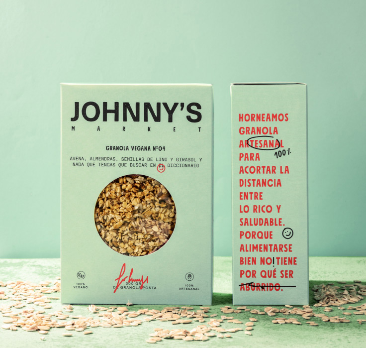
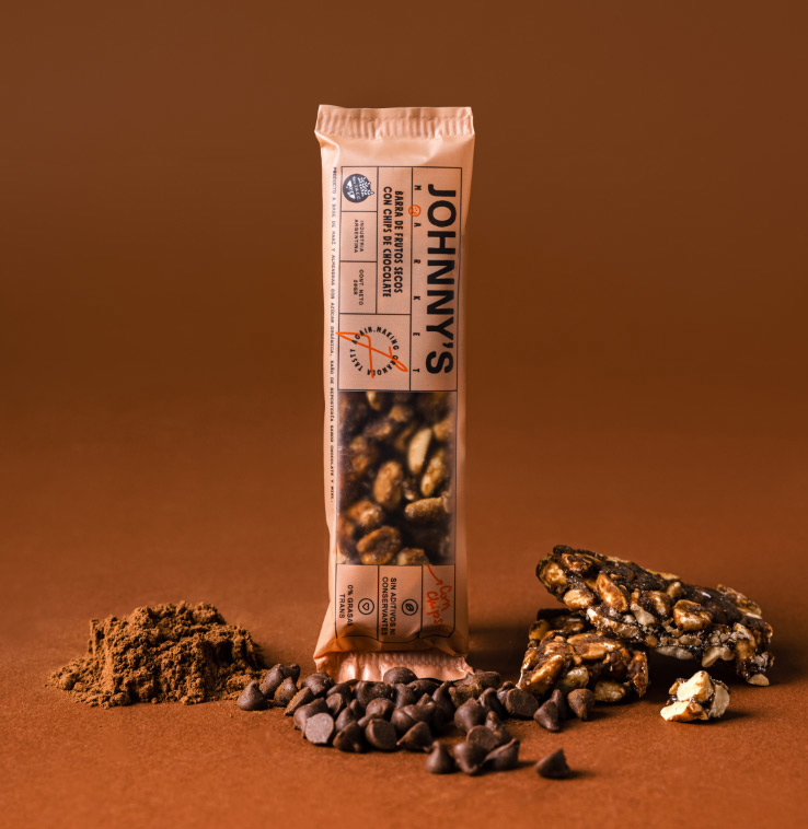
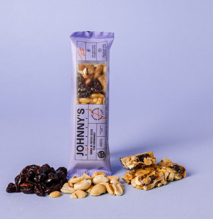
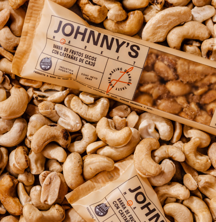
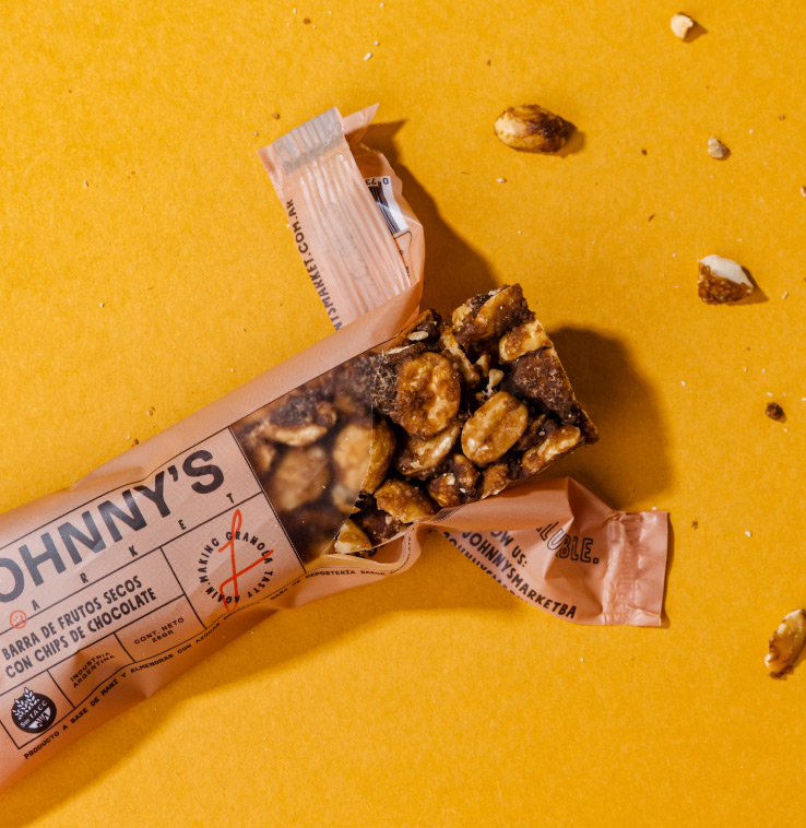
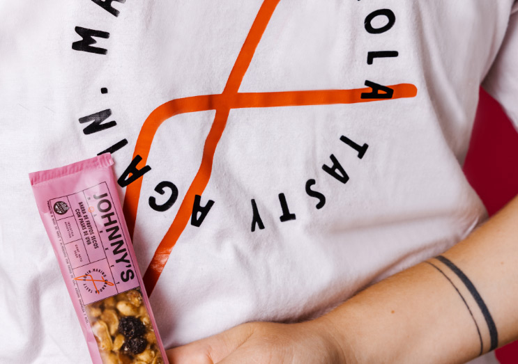
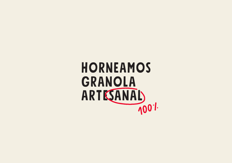
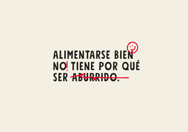
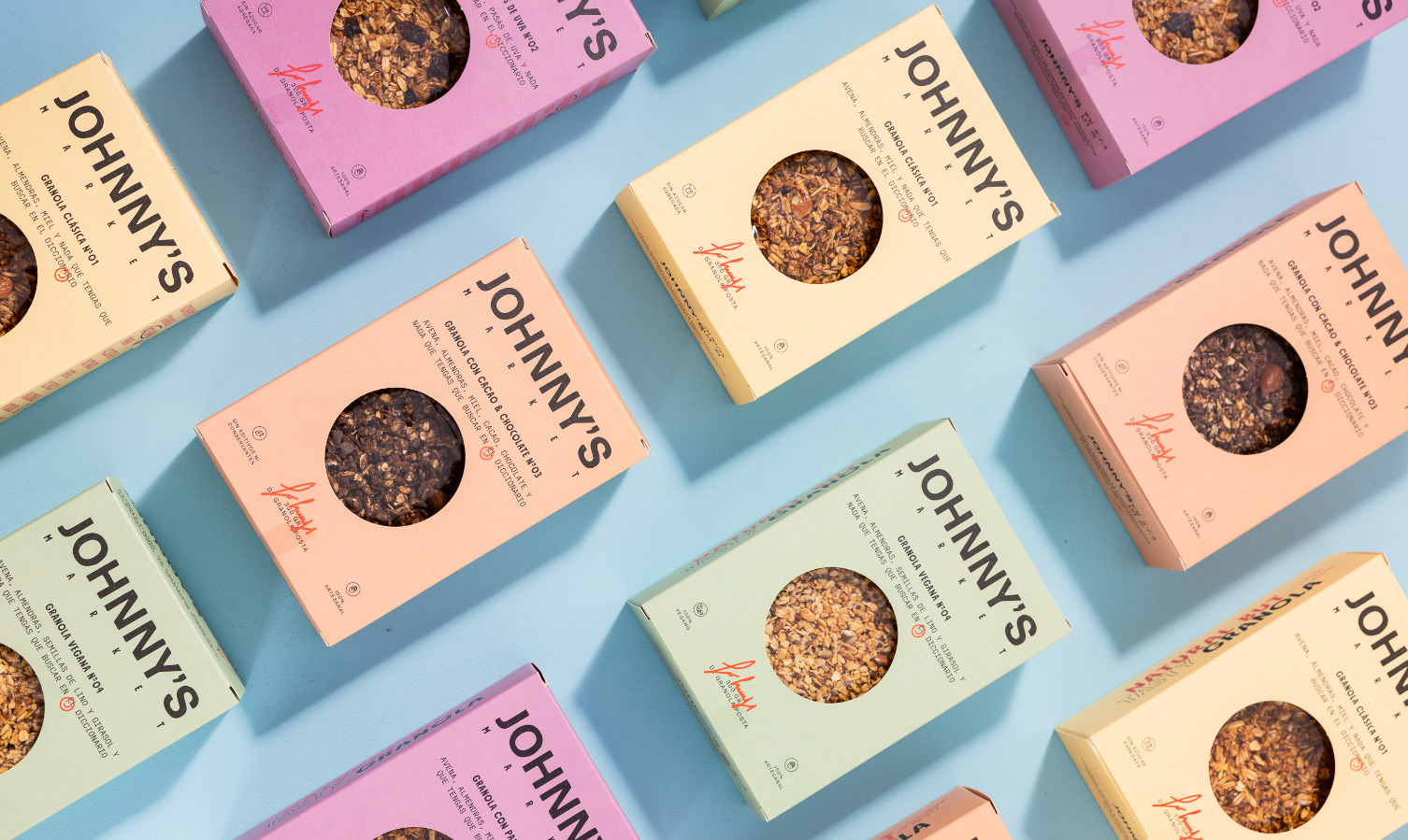
The personality was conveyed through our packaging design using a wide and cheerful color palette; bold and elongated typefaces, and freehand graphic gestures together with an approachable and witty tone of voice. Finally, we created a signature for Johnny’s that adds a personal touch to the packaging and reminds customers that Johnny’s is not just a brand, but a friend.
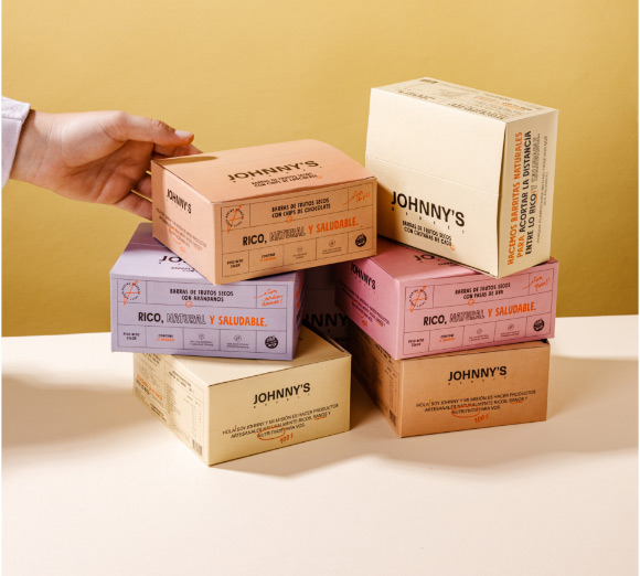
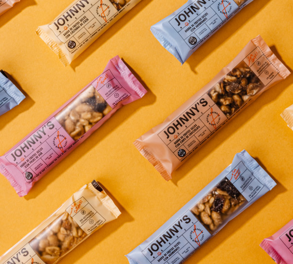
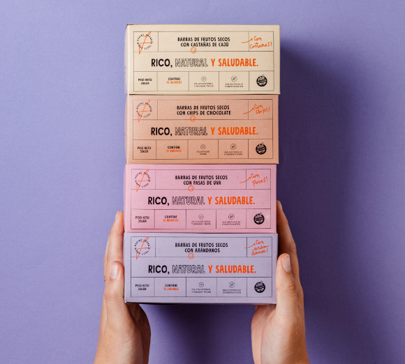
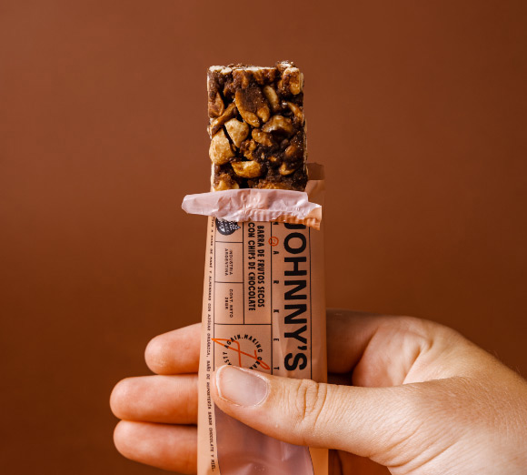
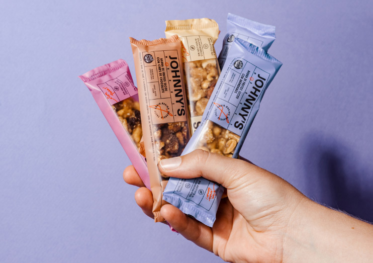
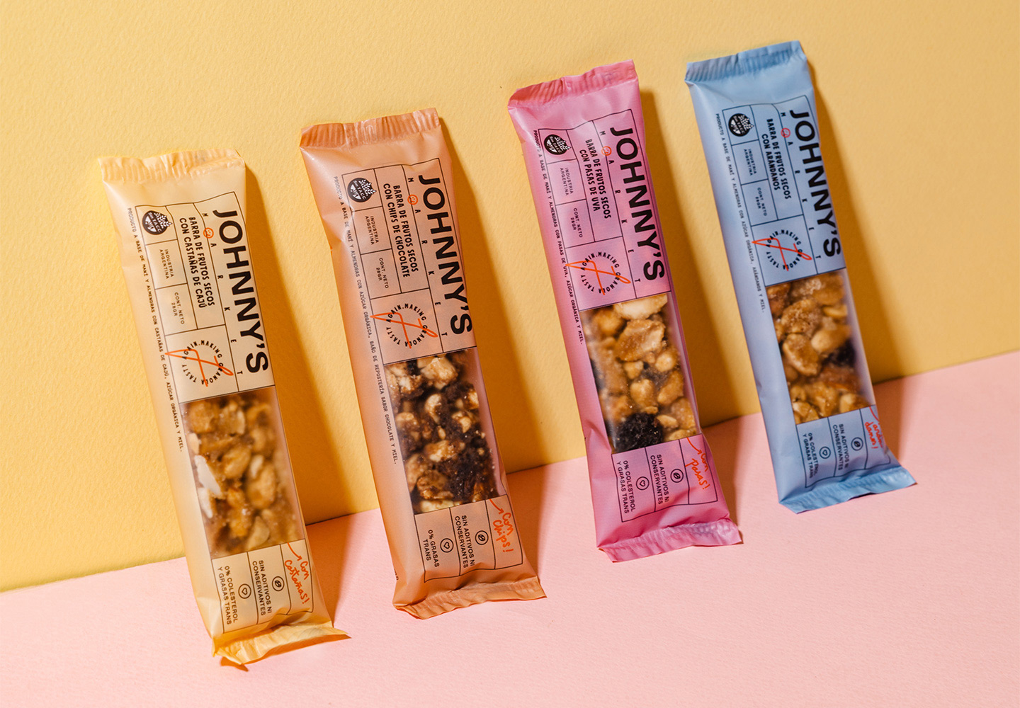
We want you to live better but we understand that you are not willing to eat something you don’t enjoy in order to be healthy. That is why, in addition to offering you products that are good for your body, we strive to do good for your spirit, with the maximum flavor.
