Sparaw
Organic Food
01.09.2021 — Buenos Aires, Argentina

The Scope

The Client

Sparaw, 01.09.2021
Buenos Aires, Argentina

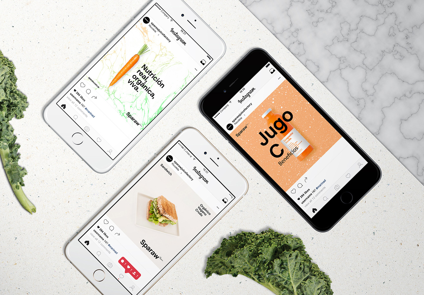
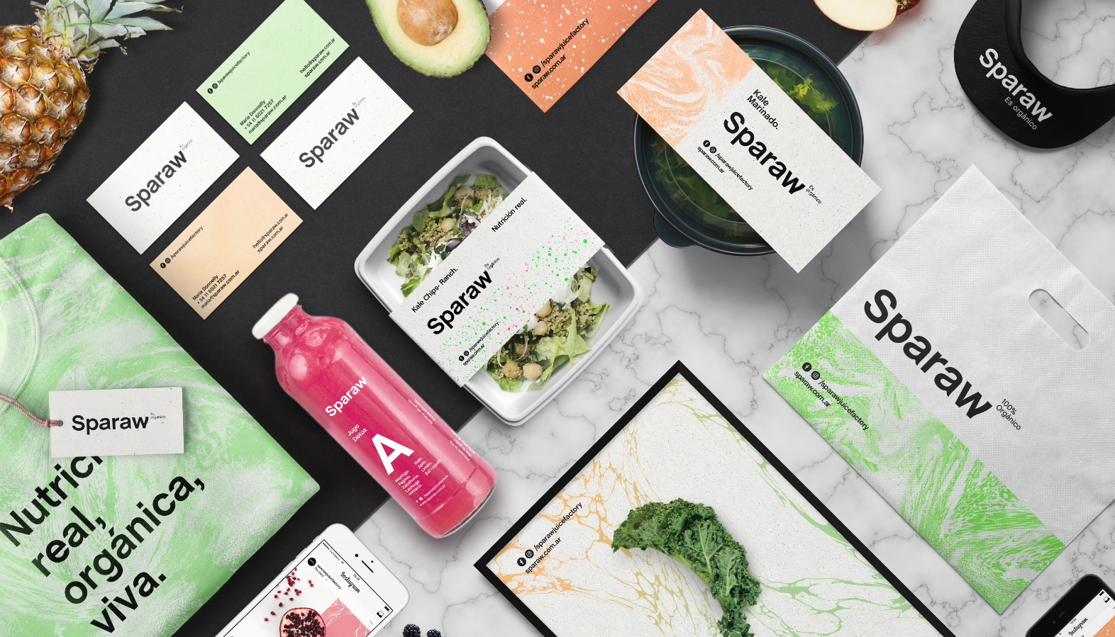
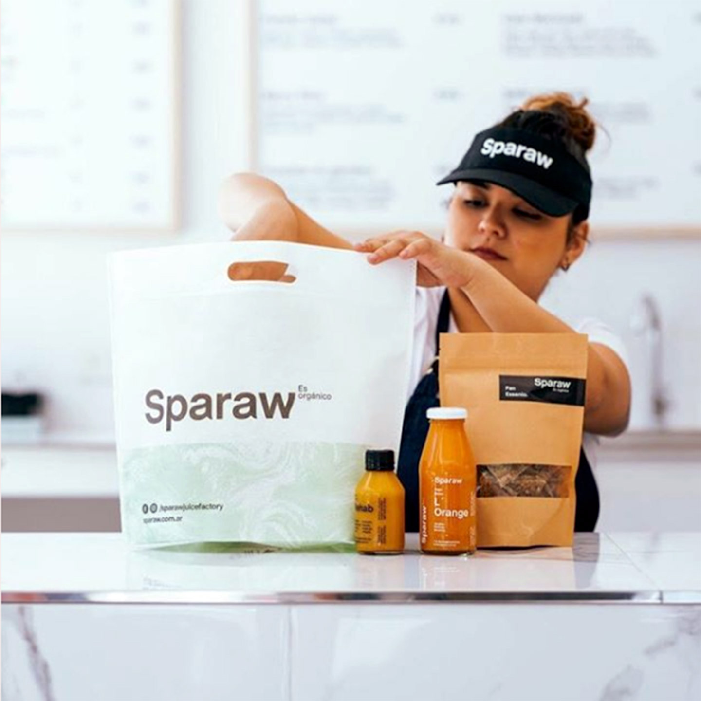
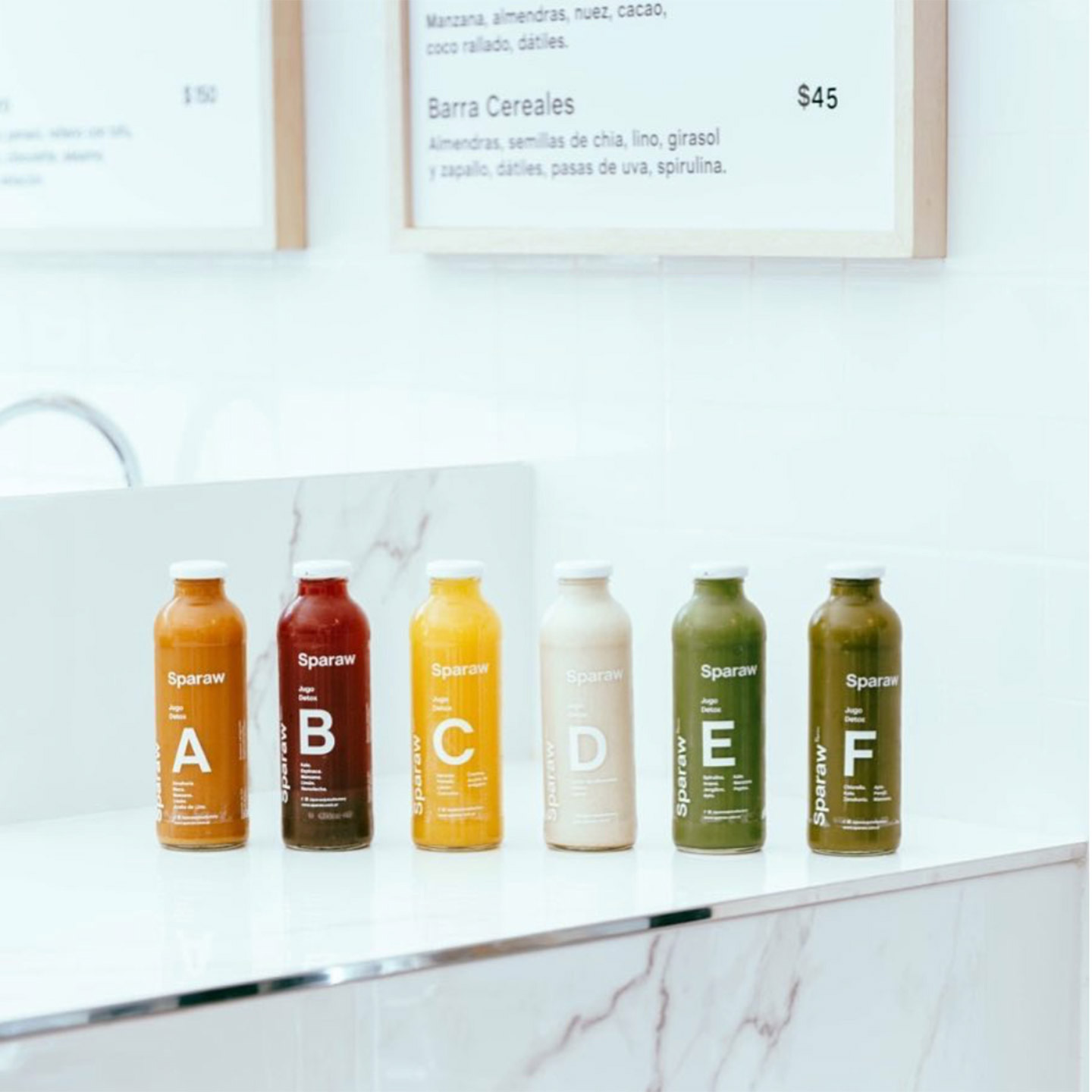
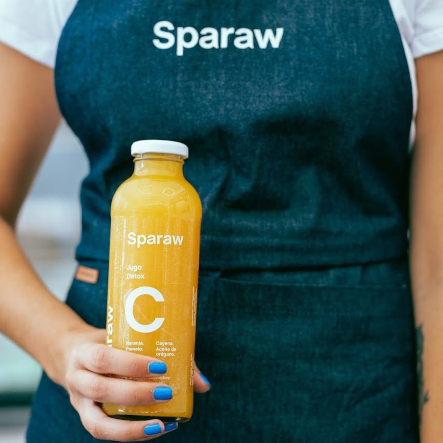
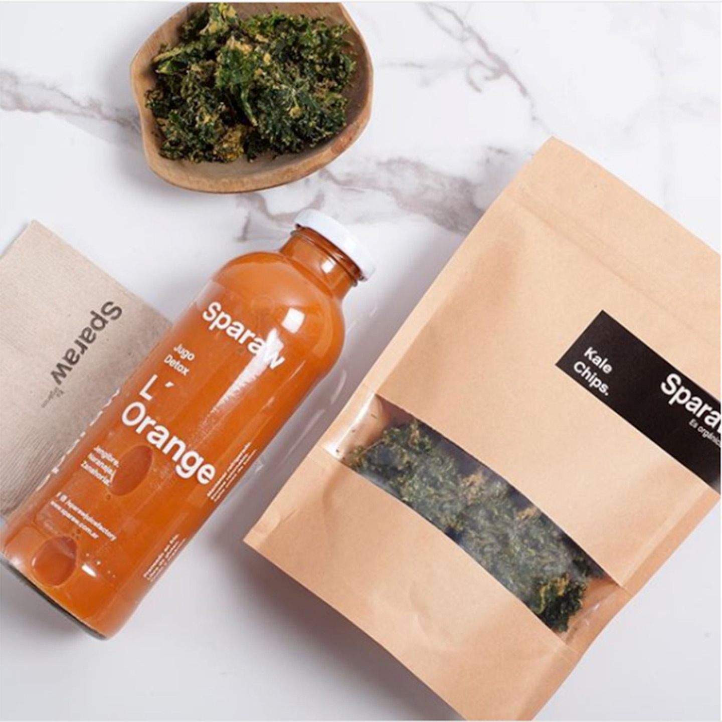
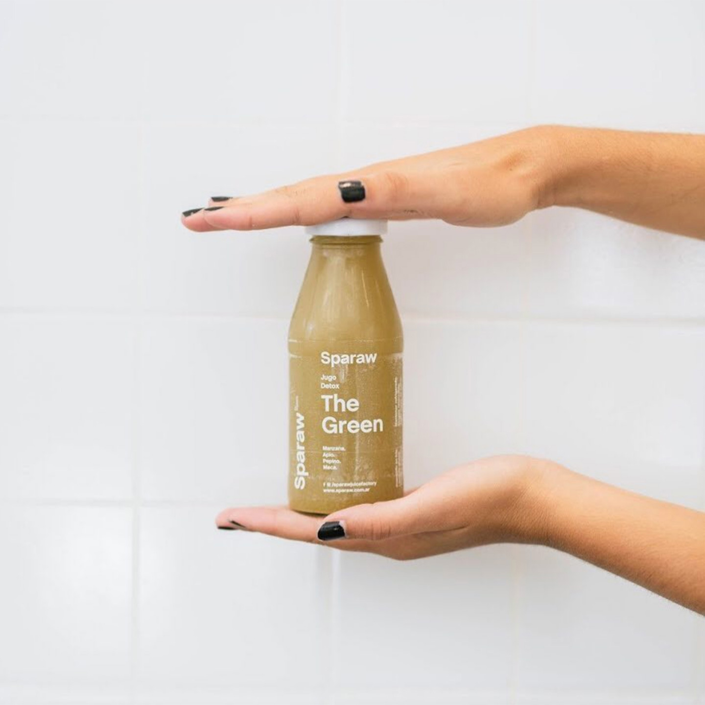
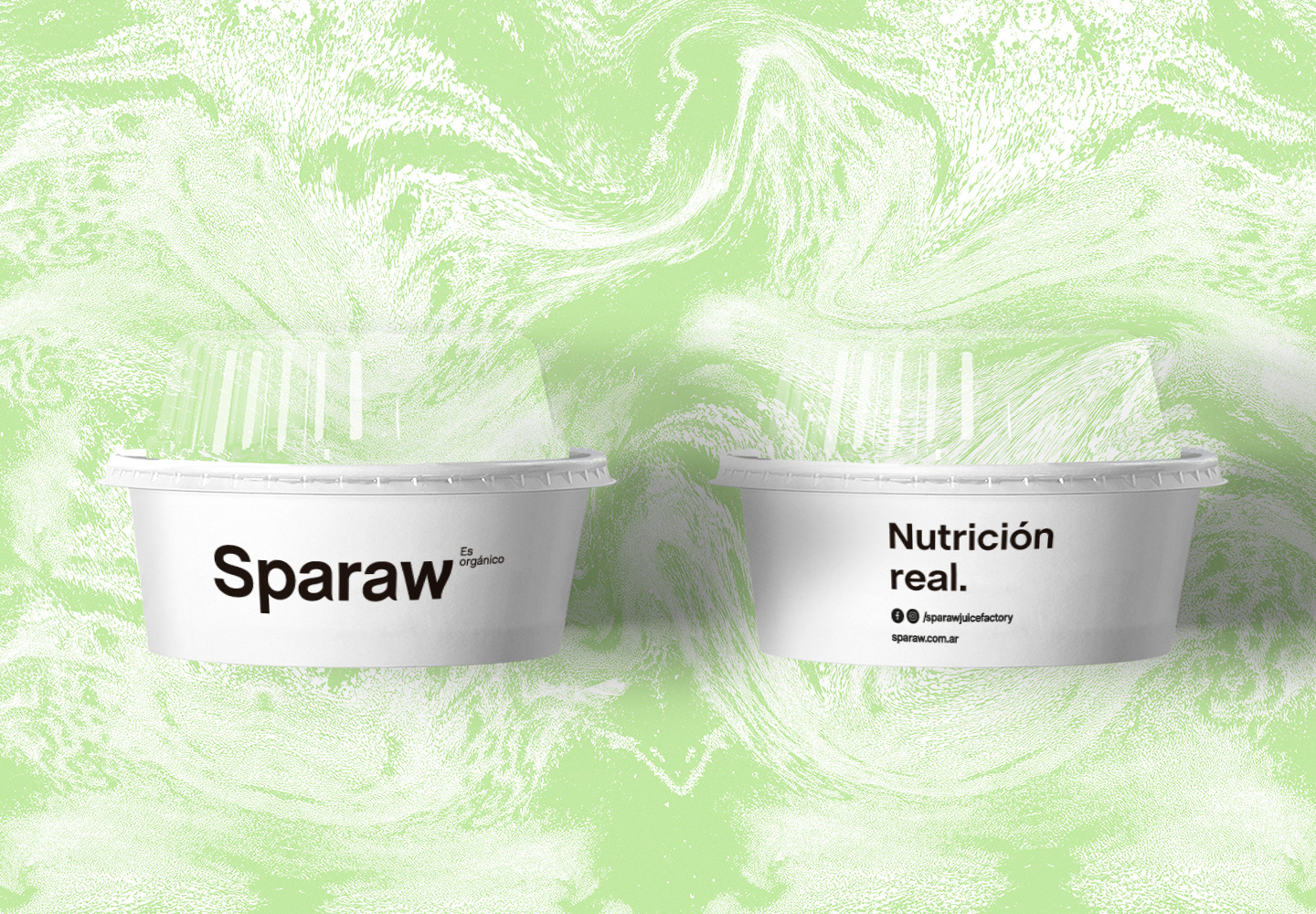
Sparaw is a well-known Argentine brand, which sells cold pressed juices and vegan food.

They came looking for us with a clear need: they wanted to expand their brand through his own retail stores with a more consistent identity since they felt that their previous identity did not convey the values ​​of the brand.

COMMERCIAL OBJETIVE
Their objetive was to position Sparaw as a premium leader brand in the raw food market.
THE STRATEGY
Generate a coherent and consistent identity system, in which all the communication pieces were aligned and convey the Sparaw philosophy, giving a more premium and authentic look.
Communicate that Sparaw is not just a nutritious juice but a lifestyle. Teach people how to consume its products and its benefits to increase consumption. Highlight their differential qualities.
THE CONCEPT
From the client’s briefing and our research we define a concept to communicate: “Sparaw is full of life”.
We really enjoyed this project, we believe the result is a strong an inspiring brand.

We chose a palette of pastel colors “almost fluo” to convey modernity, freshness, and vitality.

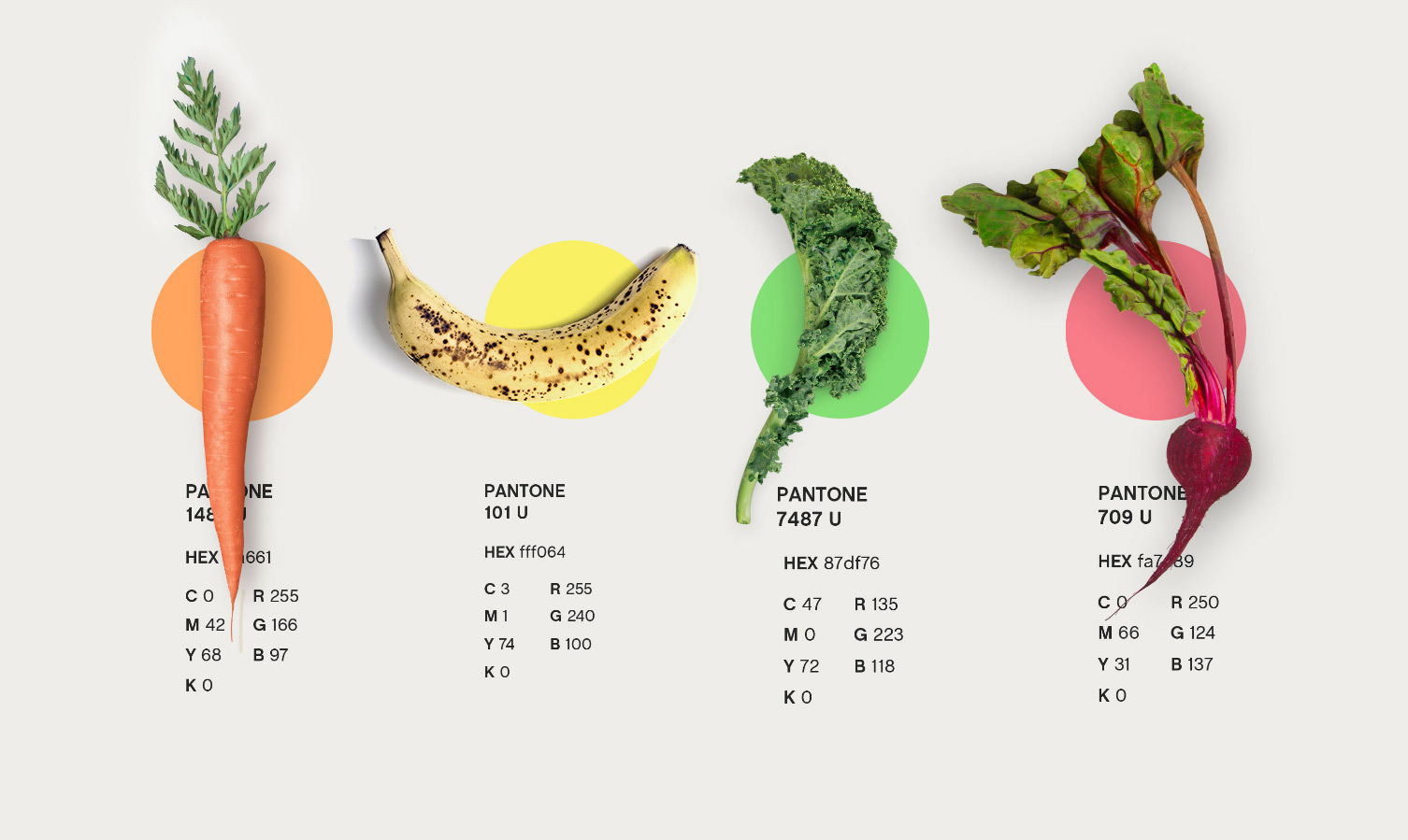
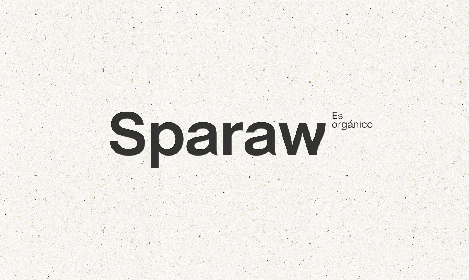
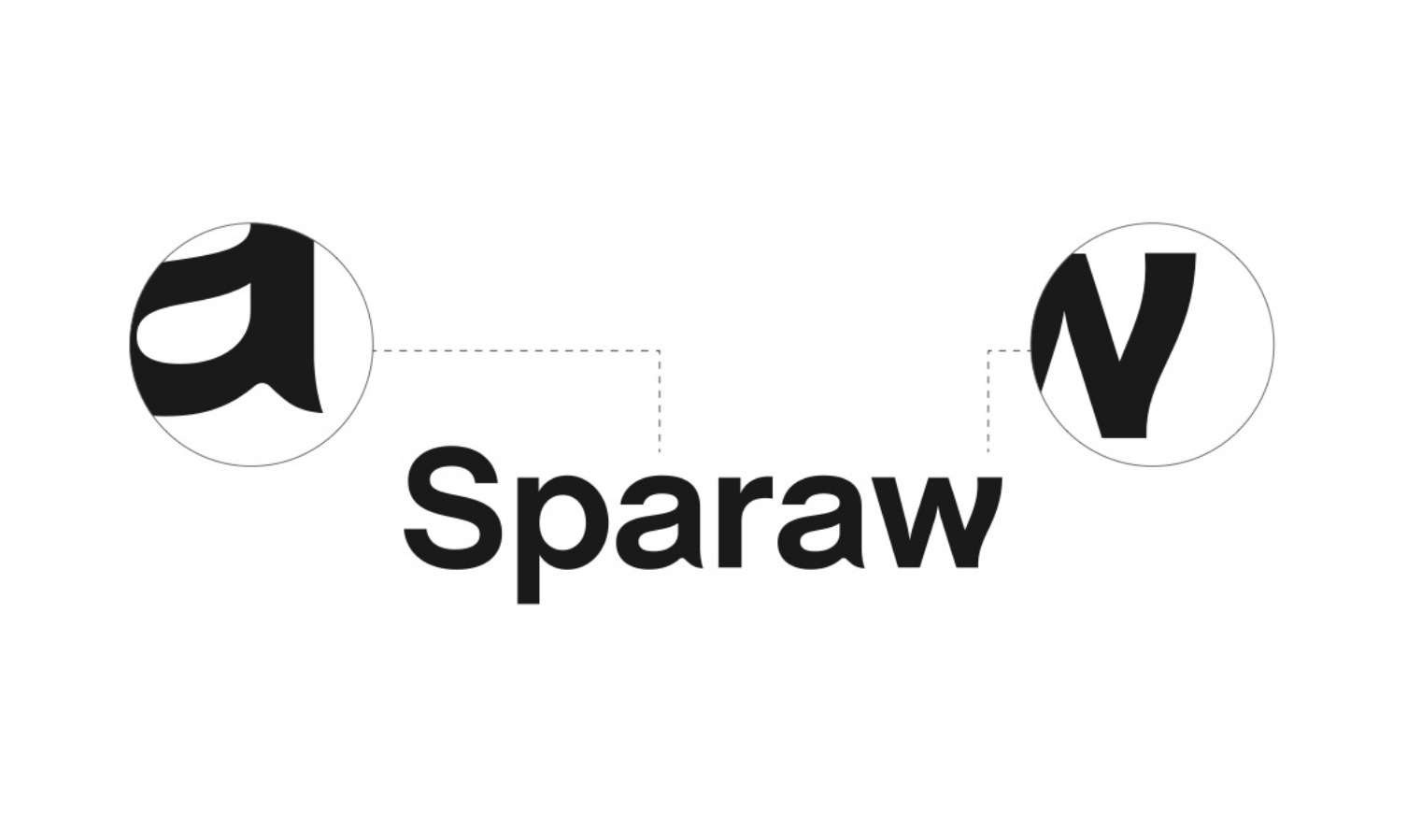
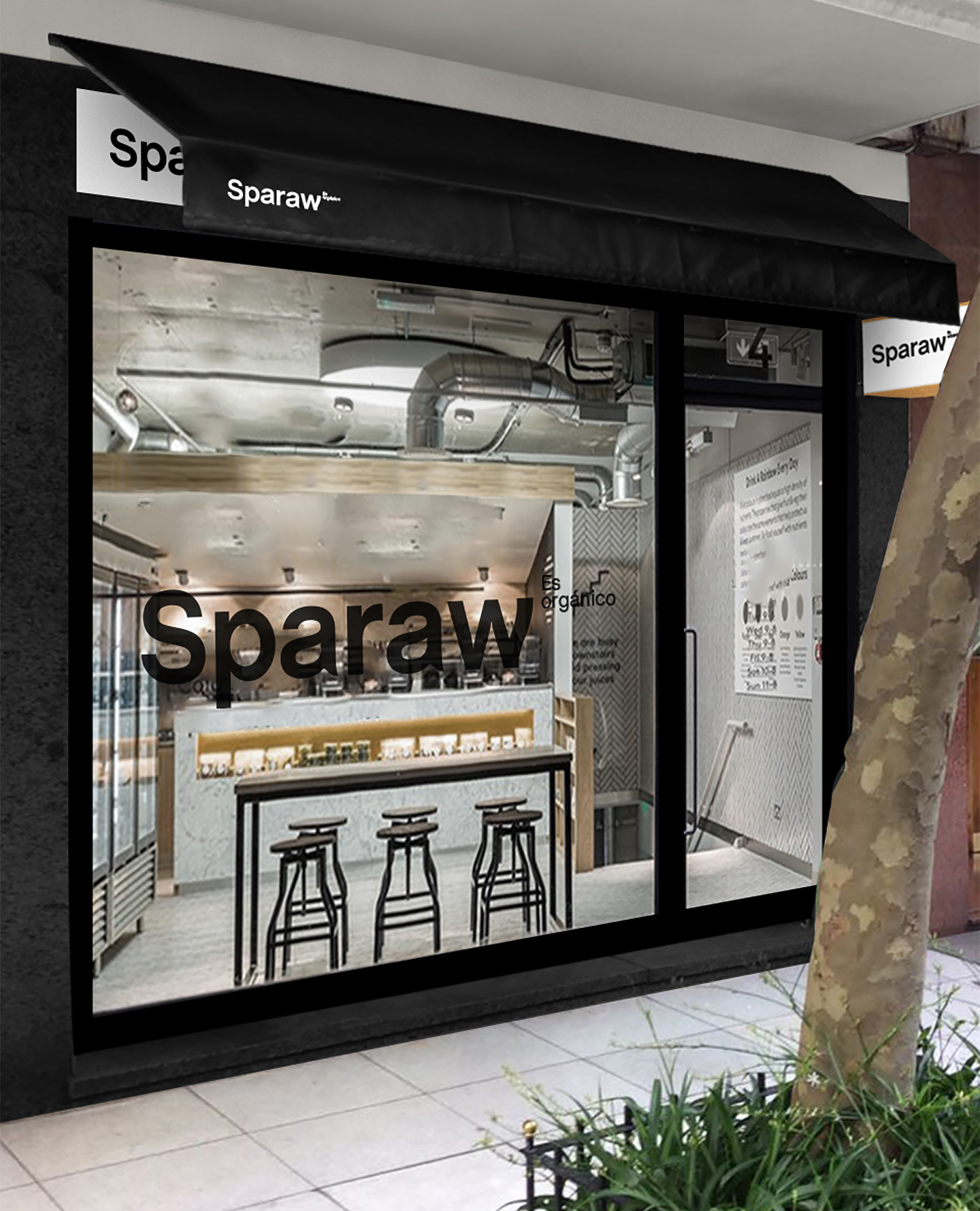
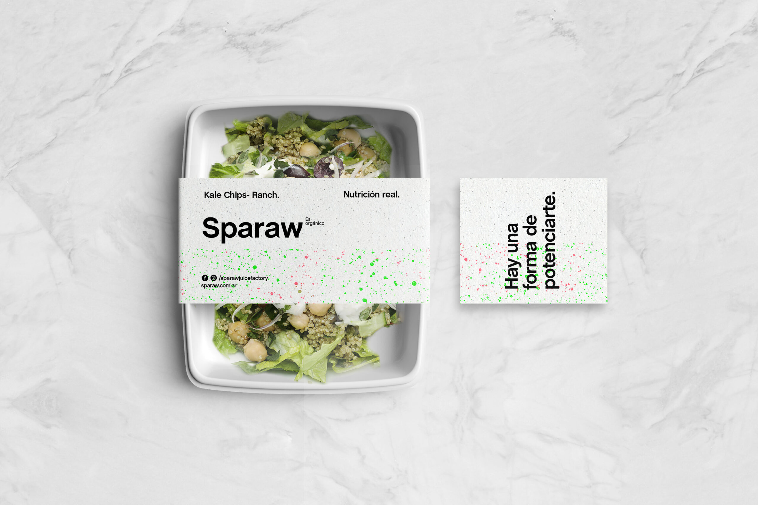
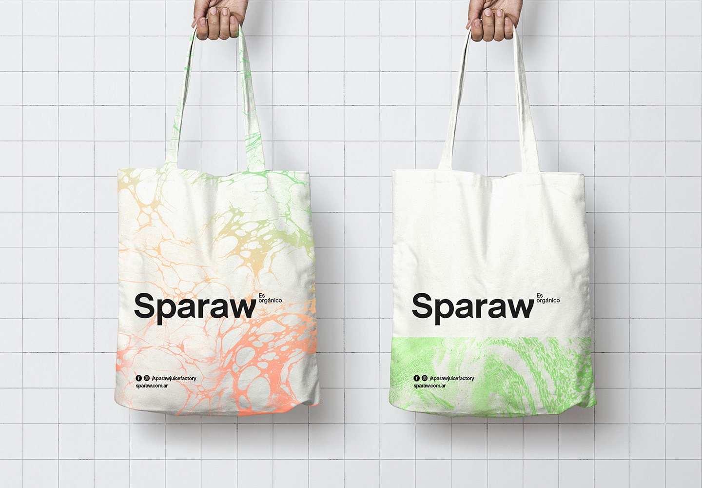
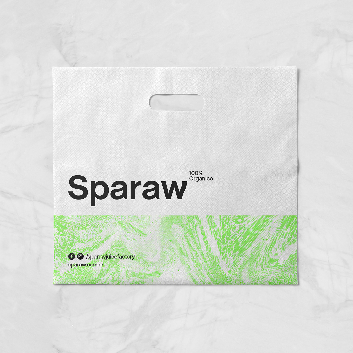
We decided to give the logo a solid feeling and a strong presence through the selection of a typography (Chalet) with enough body, modern and easy to read. The idea was to create a simple and memorable logo.

To communicate the human and soft side of the brand we decided to intervene the type by molding some of its letters, contributing with an organic and warm feeling, and thus achieving a personal and unique logo.

Being 100% organic was their great differential value so we decided to incorporate it into the logo. Its location in the main version of the logo is not random, it refers to chemical formulas.

Back to Top